
Case Study: Yellow Bear Foundation
The Struggle:
When Alexandria Lavin, founder and president of the Yellow Bear Foundation, came to us, she expressed discontent with their current logo. It lacked flexibility, the ability to scale, and with only one colorway, they weren’t able to use it on dark backgrounds. The new branding needed to be friendly and approachable, showing care and concern for Primary Immunodeficiency (PI) patients, those it advocates for, and express professionalism and trust to donors and those who help fund research. An added bonus was to include a nod to their mascot Sunny, who visits PI patients in hospitals and to the founder’s love for Notre Dame football.

Original Yellow Bear Logo
The Solution
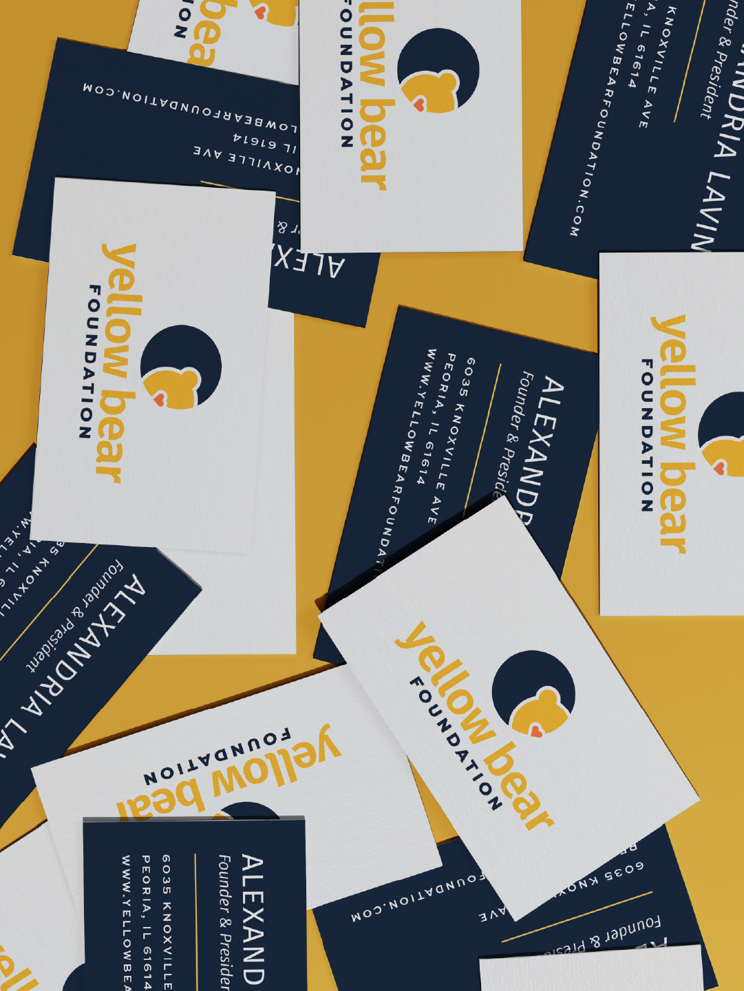
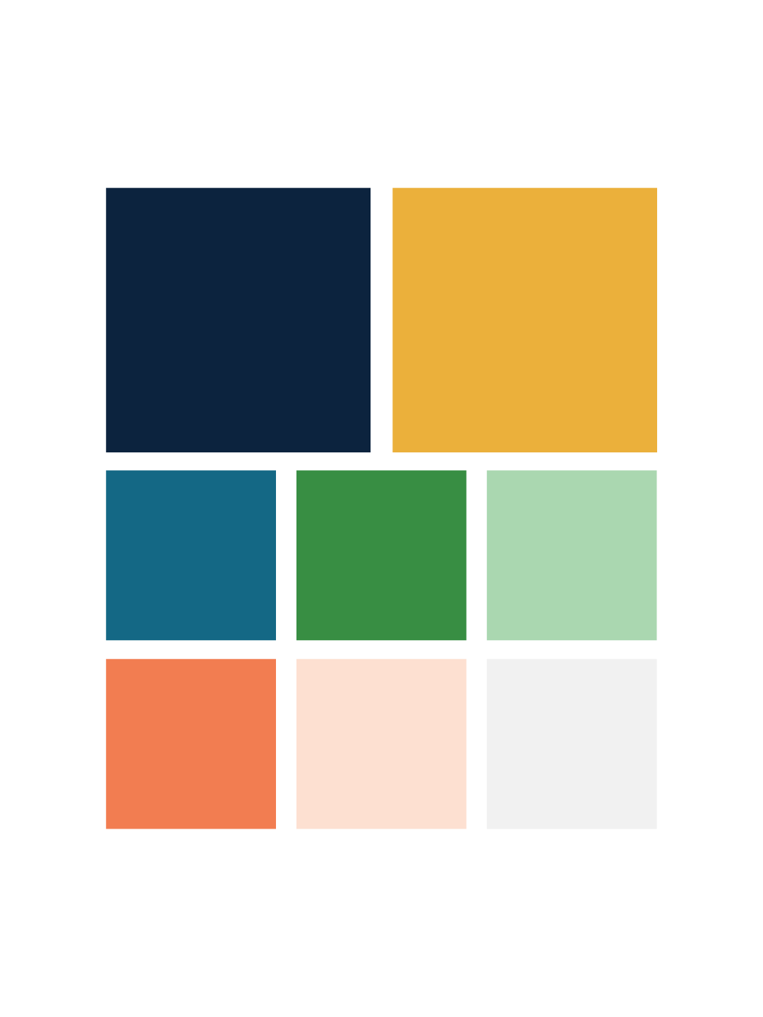
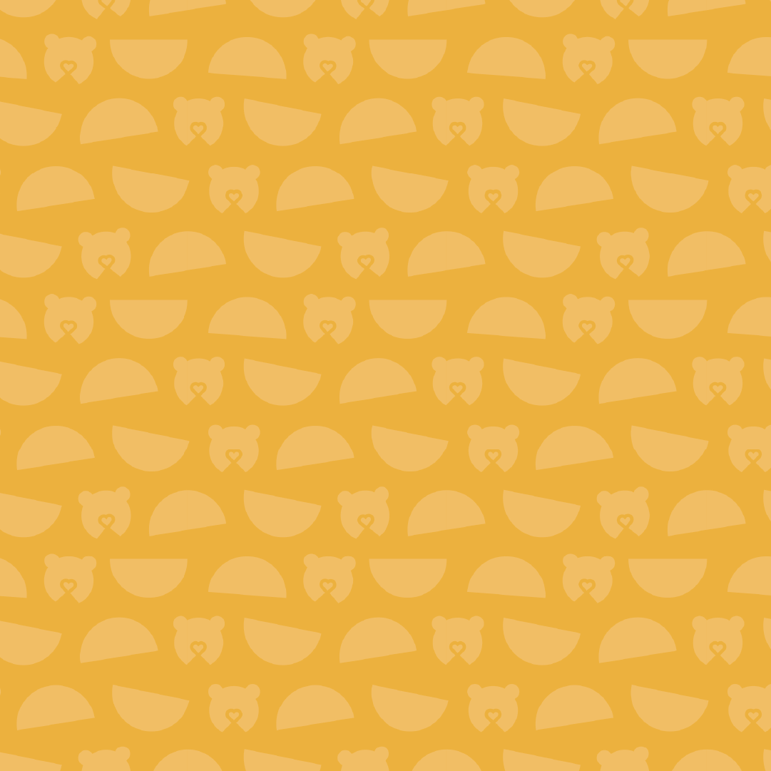
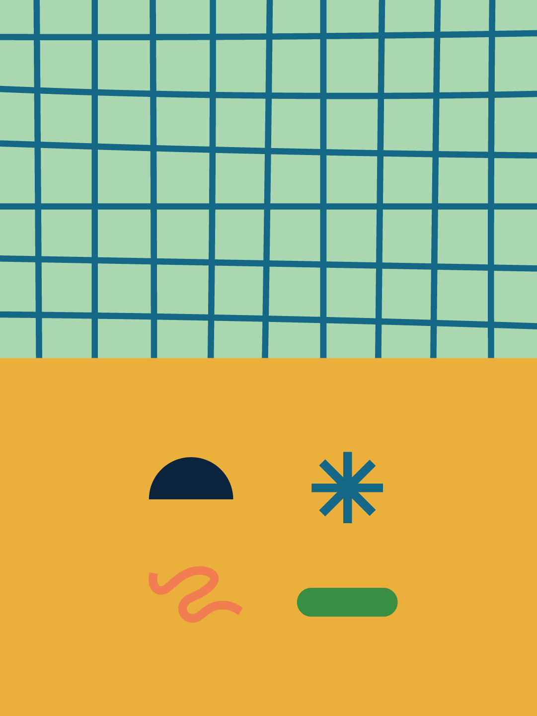
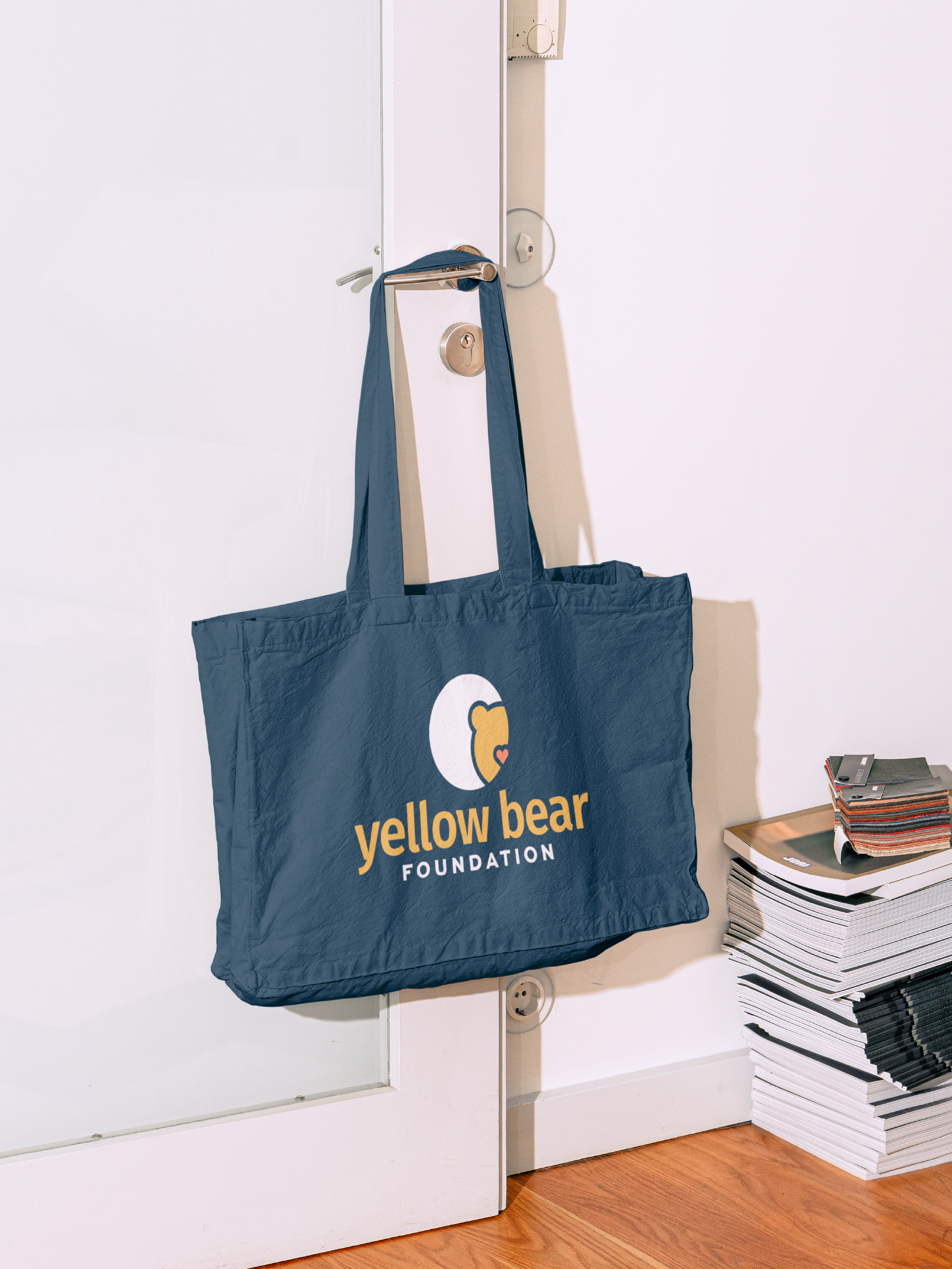
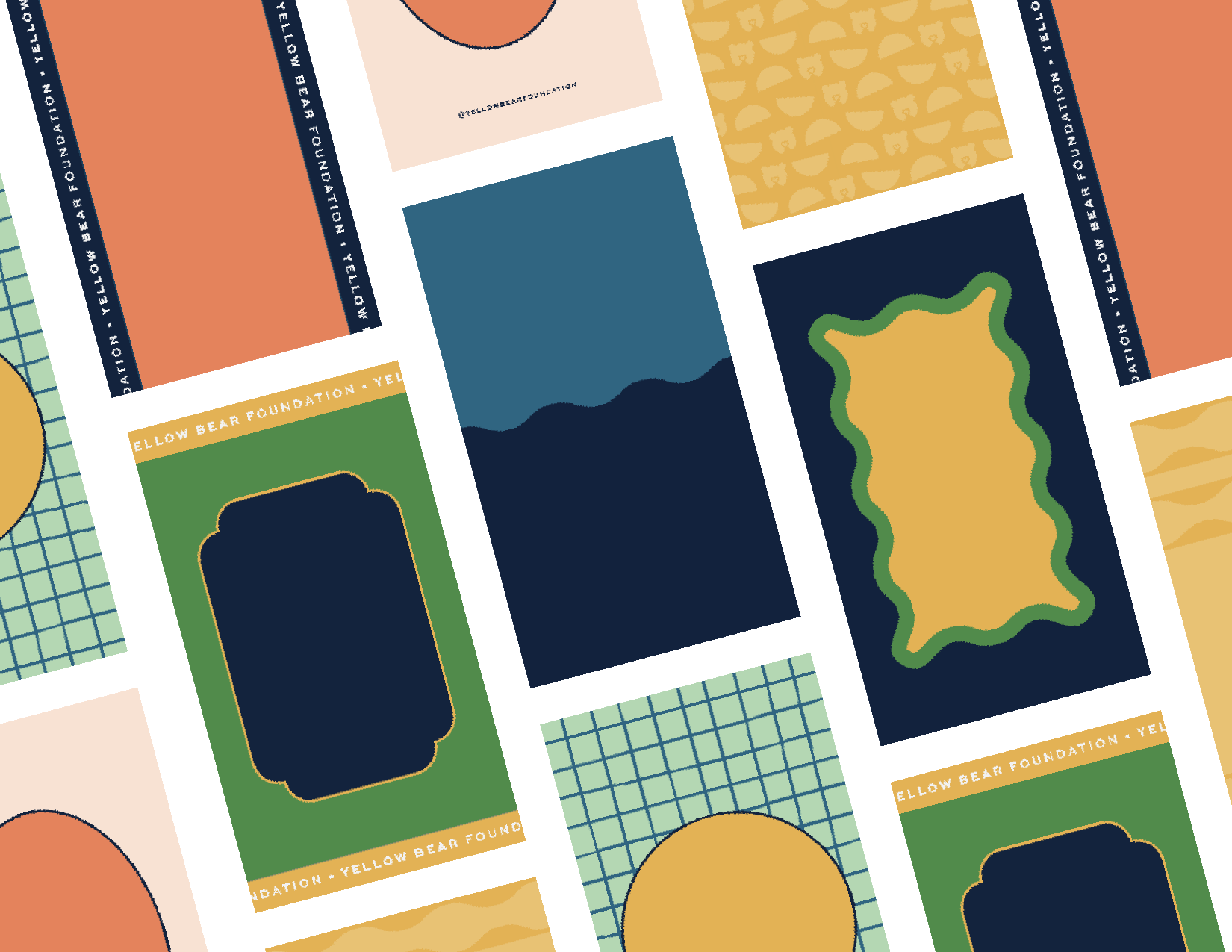
With all of this in mind, I decided to create a logo system (the bread & butter of KPD!) that is a plug and play system which can be broken down and pulled apart based on need and application. The center of the system became a depiction of Sunny the mascot with a heart as its nose to communicate the care Yellow Bear Foundation wishes to show to everyone in contact. We then built a bold and iconic typography system around the bear icon that is sleek and modern. The yellow and navy shades Yellow Bear Foundation is known for remained, but I created an entire color scheme around those two colors that would allow the identity to flourish particularly on social media.
New Primary Logo
New Secondary Logo
New Badge and Icon
It’s Success
Now Yellow Bear has a bold, modern, and professional brand identity matrix that can be utilized on various types of media. It offers the flexibility and scalability to be used on promotional print material, billboards, signage, and social media and digital ads. Because of it’s timeless, bold design it’s recognized as a non-profit leader and the premiere Primary Immunodeficiency organization in Peoria, Illinois.
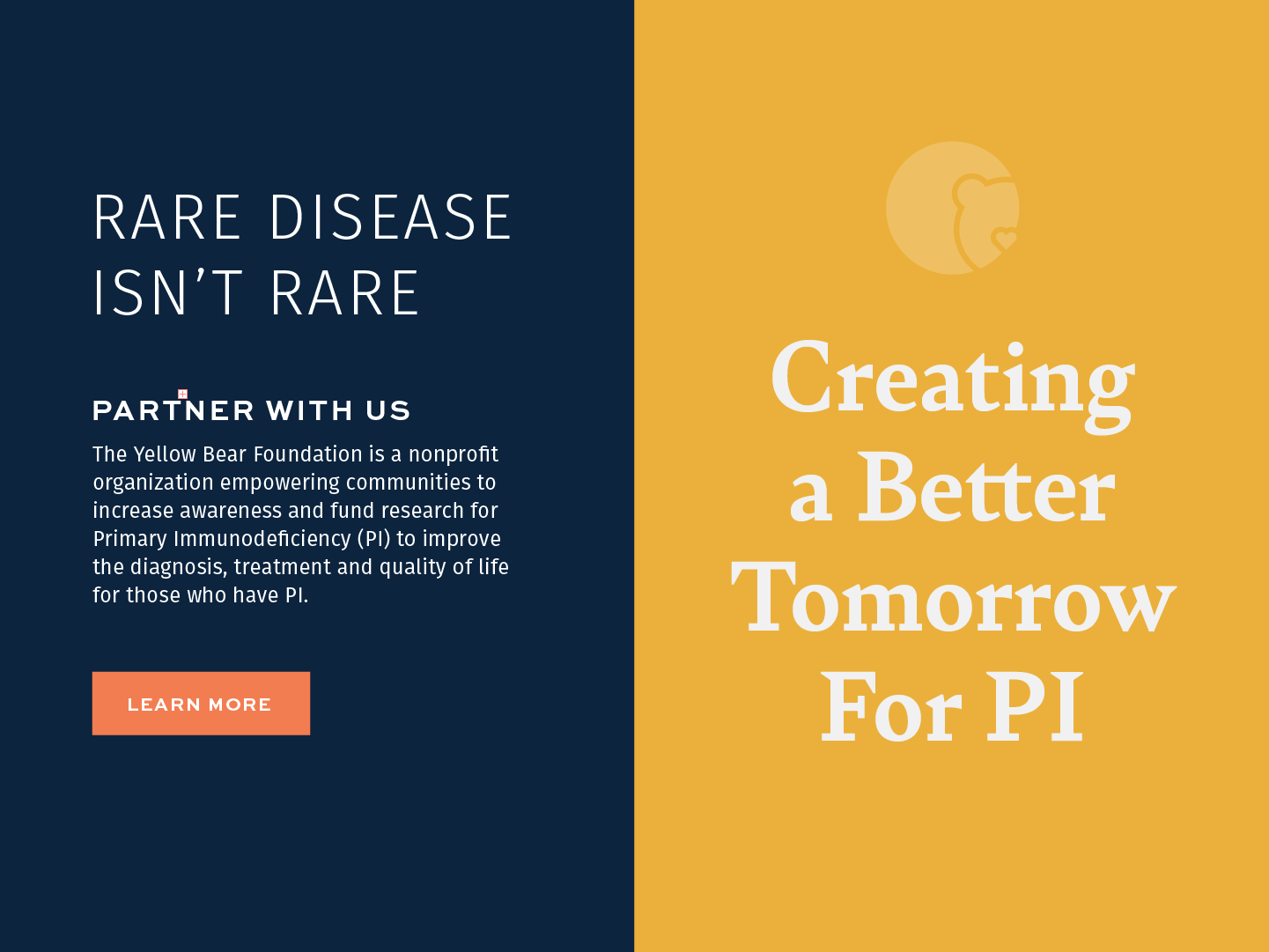
Typography System
Ready to elevate your brand? We would love to be part of your story. Please reach out!